
The new MyPalomar website format is something students have been trying to navigate throughout the year. Faculty had mentioned it would be easier to navigate classes, fees, and grades.
I have some mixed feelings about it. On one hand, navigating to find my schedule is pretty simple, but enrolling in classes is a bit more difficult. It is important to identify both pros and cons of this new format.
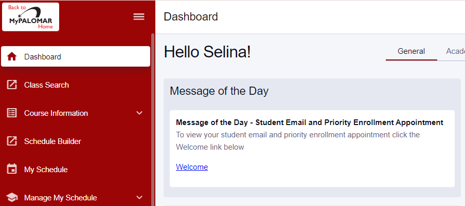
To start, I do like the red toolbar shown on the left where it shows all the folders that are needed to properly navigate the website. The website has made it easy for students to find and organize their schedule.
For instance, there are three different options: daily, weekly, or monthly. There’s also a column option for students who don’t typically like calendar format.
Additionally, grades are easy to access, simply by looking at the tool bar and clicking on the academic folder. This folder also allows students to find their education plan and request transcripts.
Now, all of these features are great, but it does have its flaws.
For starters, when I tried enrolling in classes, the multiple filters made it difficult to understand what is required to accurately search for classes. Also, when I tried putting information into said filters, an error kept popping up.
Although it is a simple flaw, it is important to be able to enroll in classes easily and efficiently. That said, the other features of this new format are great and help students understand how to navigate the website.
Comments are closed, but trackbacks and pingbacks are open.